Libraries
library(tidyverse)
library(patchwork)
library(ggpubr)
library(truncnorm)
my_theme <- theme_classic(base_size = 14) +
  theme(axis.title = element_text(size = 18))
theme_set(my_theme)library(tidyverse)
library(patchwork)
library(ggpubr)
library(truncnorm)
my_theme <- theme_classic(base_size = 14) +
theme(axis.title = element_text(size = 18))
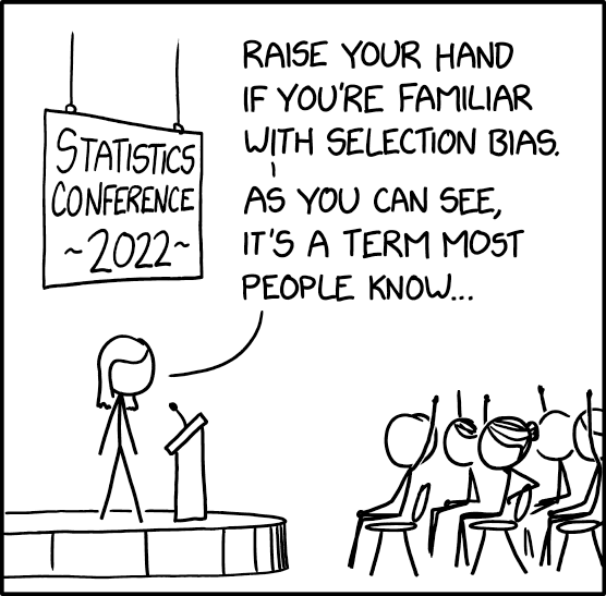
theme_set(my_theme)Who is recruited into studies has dramatic impacts on the validity and generalizability of research. See this fun xkcd comic about the subject.
This type of sampling is called “convenience sampling”.
Convenience sampling: Convenience sampling defines a process of data collection from a population that is close at hand and easily accessible to researcher. Convenience sampling allows researcher to complete interviews or get responses in a cost effective way however they may criticized from selection bias because of the difference of the target population ([1])
Convenience sampling can often, but does not always, lead to “biased samples” – or a recruited sample that distorts the relationships you want to actually understand.
And biased samples lead to biased estimates (see Section 6.1 for more on what “biased estimates” are.)
Now, generally, people are not out there trying to shoot themselves in the foot by recruiting totally invalid samples for their studies. But, tight deadlines and small budgets often win over more complex sampling methods (like stratification), and so it is common to rely on convenience (or convenience-esque) recruitment methods. Plus, it is almost impossible to design a perfect study (hence the importance of replication).
Over the years I have done analyses for many observational cohort studies. And in my training, I was taught to always first explore who is in the data before diving into deeper analysis in order to identify any potential bias in the sampling. And very often it comes to light that there is some kind of sampling bias.
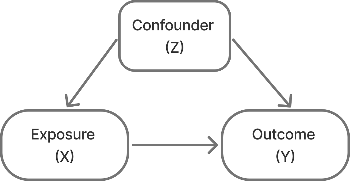
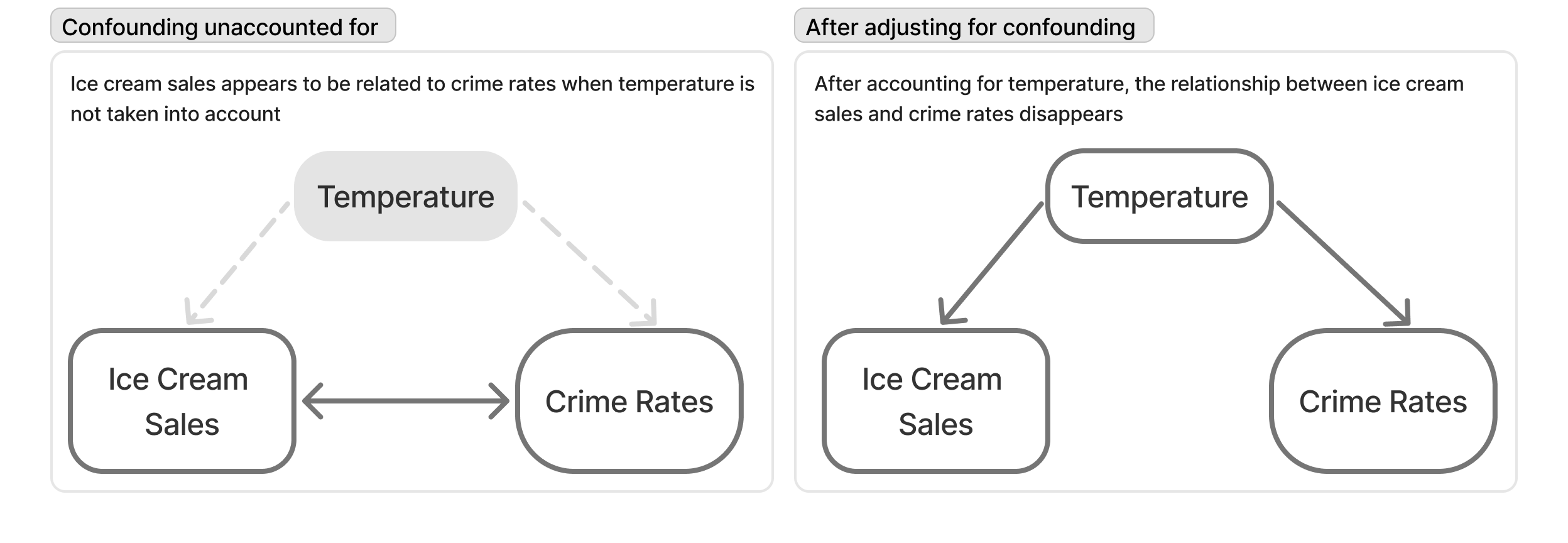
One particular way that sampling bias can impact a study is that it can induce confounding bias.
Confounding – I’ve also seen this referred to as the “mixing of effects”. It is when the relationship you’re trying to observe between two variables (X and Y) are mixed in with effects of another factor (Z) and distort the true relationship between your two variables of interest.
So, in the case of sampling bias what happens is that you recruit a sample and do it in such a way that you accidentally create unintended (or nonexistent) relationships between a feature of your dataset (Z, the confounding) and the variable your interested in (X) and Z and the outcome your interested in (Y).
A classic example of confounding is the finding that ice cream sales are correlated with crime rates. This is a spurious relationship that is actually the result of temperature driving ice cream sales and crime rates separately (see Section 6.2)!
But, let’s stick to a more relevant example to classic public health kinds of studies.
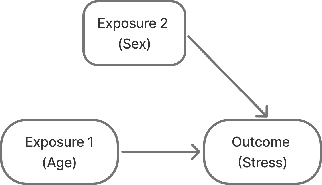
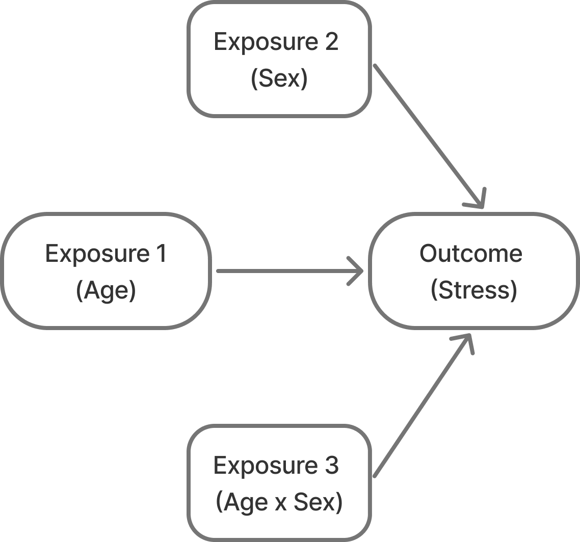
Let’s say we want to run a study where we want to assess stress levels in pre-teens to college age students. We expect that as students get older, their stress increases. We might also expect that females might report more stress than males on average.
So, this is our expected model of the relationships:
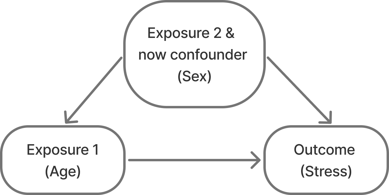
So, we go to recruit our cohort and do so via convenience sampling. We recruit a population of 10-25 year olds and measure their stress scores. When we look at the distribution of males in the dataset, however, we notice that we accidentally didn’t recruit males who are > 20 years of age! Why did this happen?? Maybe drinking age males are less interested in participating in studies?? Or maybe we just didn’t have that age and sex demographic group in our convenience domain.
No matter the reason, this sample results in relationships like Figure 3 instead of what we believe/know to be true in Figure 2. Not only are males going to be younger on average (spuriously, males are not inherently younger than females (at least at this age)…), but they are also going to have lower scores on average. So being male is correlated with both our outcome and our exposure.
What are the impacts of a sampling bias like this? Can we correct for them in the models? What are the limitations?
So, let’s do a simulation! We’ll simulate a toy dataset of a study design like the one mentioned above. And we’ll fit various models to see how biased or unbiased the age effects are.
I’m going to simulate a study where:
where:
\(\beta_0 = 10\) as the intercept
\(\beta_1 = 0.5\) as the true relationship between age and stress
\(\beta_2 = 3\) as the relationship between sex and stress
\(\epsilon \sim N(0, 5)\) as random noise
generate_data <- function(n = 1000,
                          min_age = 10,
                          male_max_age = 20,
                          female_max_age = 25,
                          mean_age = 16,
                          sd_age = 10,
                          true_beta_age = 0.5,
                          true_beta_sex = 3,
                          true_beta_interaction = 0,
                          sigma = 5) {
  # Generate sex
  sex <- rbinom(n, 1, 0.5)

  # Generate age by sex
  age <- if_else(sex == 1,
    rtruncnorm(length(sex == 1),
      a = min_age,
      b = female_max_age,
      mean = mean_age,
      sd = sd_age
    ),
    rtruncnorm(length(sex == 0),
      a = min_age,
      b = male_max_age,
      mean = mean_age,
      sd = sd_age
    )
  )

  # Generate outcome
  epsilon <- rnorm(n, 0, sigma)
  y <- 10 + true_beta_age * age +
    true_beta_sex * sex +
    true_beta_interaction * age * sex +
    epsilon

  # Return tibble
  tibble(
    y = y,
    age = age,
    sex = factor(sex, labels = c("Male", "Female"))
  )
}
This results is something that looks like this…
generate_data() |>
  ggplot(aes(x = age, y = y, color = sex)) +
  geom_point(alpha = 0.25, shape = 3) +
  stat_smooth(method = "lm") +
  scale_color_manual("", values = c("red", "blue")) +
  theme_classic(base_size = 14) +
  labs(x = "Age (yrs)",
       y = "Stress")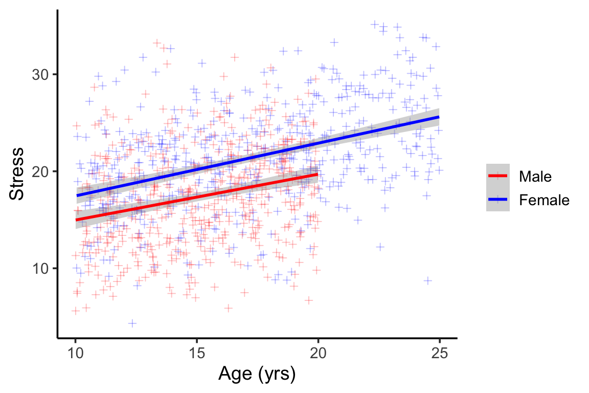
We can see the obvious lack of males in the older age groups (Figure 4) . We can also see that males tend to report lower scores than females, but that the slope of age and stress is parallel between males and females (no interaction).
As the researcher, I might not have perfect knowledge of the relationships here, so based on our Figure 2, I might want to fit two different models:
One without sex as a covariate: \[stress=\beta_0+\beta_1Age+\epsilon\]
One with sex as a covariate:
\[Stress = \beta_0 + \beta_1Age + \beta_2Sex + \epsilon\]
Model 1 should give us a biased estimate of the relationship between age and stress – that is the \(\hat{\beta_1}\) that this model gives us should not equal the true \(\beta_1 = 0.5\)
Model 2 should theoretically give us a less biased estimate for \(\hat{\beta_1}\) , because there is no interaction effect with age and sex (we’ll see what happens later if this changes).
Then we’ll do this a 1000 times and see what the average bias looks like.
Now, for fun, I’m also going to generate an unbiased sample – that is, where males are not artificially truncated at age 20 – to illustrate that both models give us unbiased estimates of age effects when sampling is unbiased. (Though the estimate is noisier without adjustment.)
fit_models <- function(n = 1000,
                          min_age = 10,
                          male_max_age = 15,
                          female_max_age = 25,
                          mean_age = 18,
                          sd_age = 10,
                          true_beta_age = 0.5,
                          true_beta_sex = 5,
                          true_beta_interaction = 0,
                          sigma = 5) {
  # Generate data
  data <- generate_data(
    n,
    min_age,
    male_max_age,
    female_max_age,
    mean_age,
    sd_age,
    true_beta_age,
    true_beta_sex,
    true_beta_interaction,
    sigma
  )

  # Fit models
  model1 <- lm(y ~ age, data = data)
  model2 <- lm(y ~ age + sex, data = data)

  # Extract coefficients for age
  c(
    unadjusted = coef(model1)["age"],
    adjusted = coef(model2)["age"]
  )
}Figure 5 shows the distribution of the estimated effects from each scenario as well as their bias (or difference between the estimated effect and the known true effect of 0.5).
Sampling bias such as this does in fact induce a positive confounding effect, where without accounting for sex we see an exaggerated effect size – it appears that stress increases almost 0.9 points per year of age, when we know that the true estimate is around half of that, 0.5 points per year.
When we adjust for sex in a scenario where we have known sampling bias that induces confounding, we can see that the new effect size for age is no longer biased! Hoorraayy!
So, in a perfect world where:
sampling bias based can be accounted for by adding the known confounder into the model!
sims_df <- as_tibble(t(
  replicate(
    1000,
    fit_models()
  )
)) |>
  mutate(condition = "Biased sampling\n(No males > 20yrs old)") |>
  bind_rows(as_tibble(t(
    replicate(
      1000,
      fit_models(male_max_age = 25)
    )
  )) |>
    mutate(condition = "Unbiased sampling\n(Males & females have same distributions)"))

sims_df <- sims_df |>
  pivot_longer(-condition) |>
mutate(bias = value - 0.5)p1 <- sims_df |>
ggplot(aes(x=value, fill = name)) +
geom_density( alpha =0.5) +
facet_wrap(~condition) +
labs(x = 'Estimated effect',
y = "Stress")+
geom_vline(xintercept = 0.5,
linetype = 2,
color = 'black',
alpha = 0.5) +
annotate(geom = "text",
y = Inf,
x = 0.6,
vjust = 1.5,
hjust = 0.4,
label = "<- True effect")
p2 <- sims_df |>
ggplot(aes(x=bias, fill = name)) +
geom_density( alpha =0.5) +
facet_wrap(~condition) +
labs(x = "Difference in observed & true effect (bias)",
y = "Stress") +
geom_vline(xintercept = 0,
linetype = 2,
color = 'black',
alpha = 0.5)+
annotate(geom = "text",
y = Inf,
x = 0,
vjust = 1.5,
hjust = 0,
label = "<- No bias")
(p1/p2) + plot_layout(guides = "collect") &
scale_fill_manual("Adjusted for confounding", values = c("darkgreen", "red"),
labels = c("Yes",
"No")) &
theme(legend.position = 'bottom')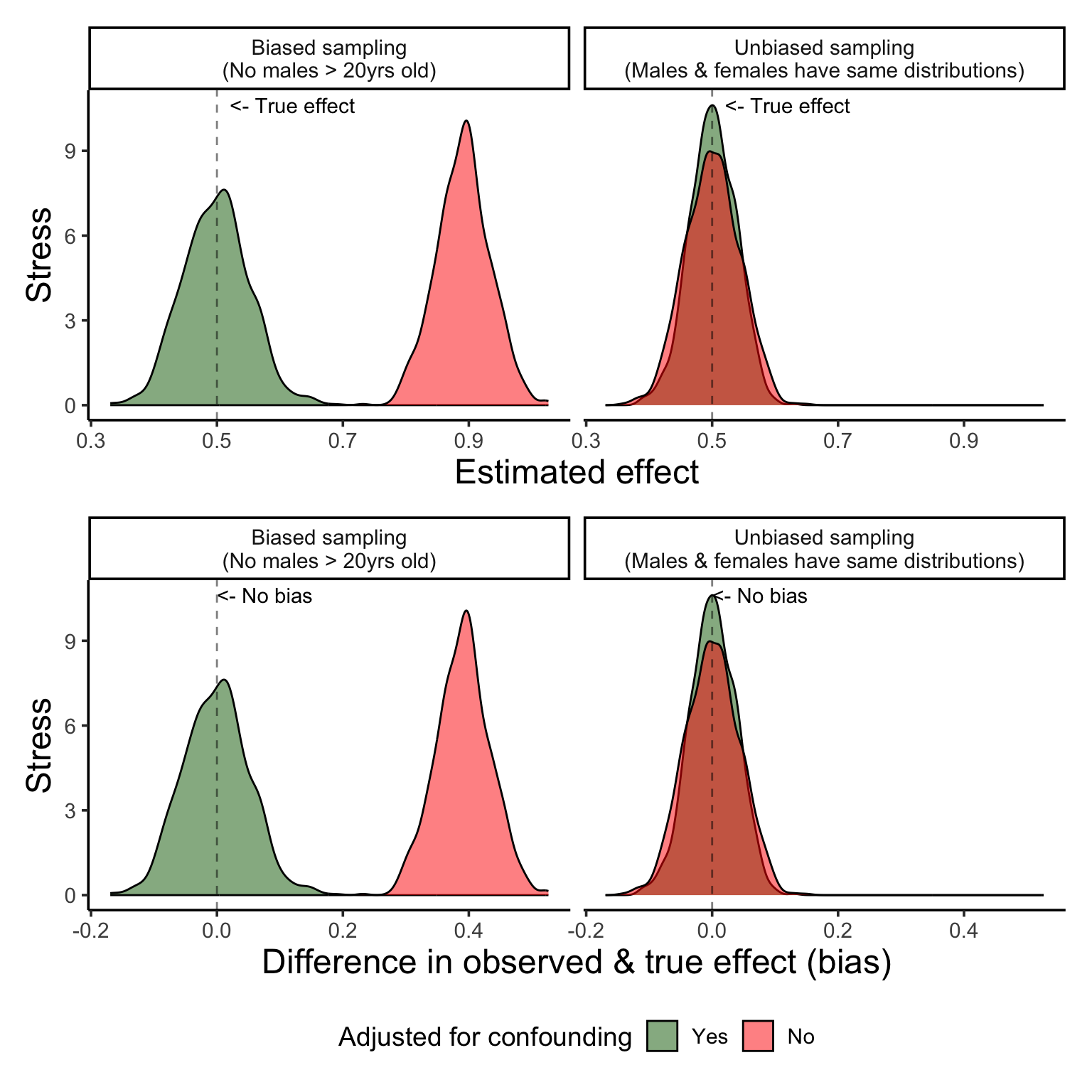
But… what if some of these assumptions we made weren’t true? What if the underlying data generating process wasn’t what we thought it was? Say we look at our data and notice our sampling bias, but the lines between male and female look basically parallel and we don’t believe that there should be an interaction between age and sex. We might think, ok, I’ll just go ahead and adjust for sex and call it a day.
So, our relationships actually look more like this:
To see what gives us the least biased estimates we’ll do the same thing as before, but let’s assume that there is a slight interaction effect between age and sex – that is, let’s say that females get more stressed sooner than males do.
So, now, the assumed data generation process is as follows:
\(Stress = \beta_0 + \beta_1Age + \beta_2Sex + \beta_3Age*Sex+ \epsilon\)
where:
\(\beta_0 = 10\) as the intercept
\(\beta_1 = 0.5\) as the true relationship between age and stress
\(\beta_2 = 3\) as the relationship between sex and stress
\(\beta_3 = 0.2\) as the slight interaction between age and sex and stress – that is, the being females affords 0.2x steeper age-related increase in stress than males
\(\epsilon \sim N(0, 5)\) as random noise
Figure 7 shows us this new sample, and we can see that as our cohort gets older stress increases more rapidly for females than it does for males, but only slightly.
set.seed(1234)
generate_data(true_beta_interaction=0.2) |>
  ggplot(aes(x = age, y = y, color = sex)) +
  geom_point(alpha = 0.25, shape = 3) +
  stat_smooth(method = "lm") +
  scale_color_manual("", values = c("red", "blue")) +
  theme_classic(base_size = 14)  +
  labs(x = "Age (yrs)",
       y = "Stress")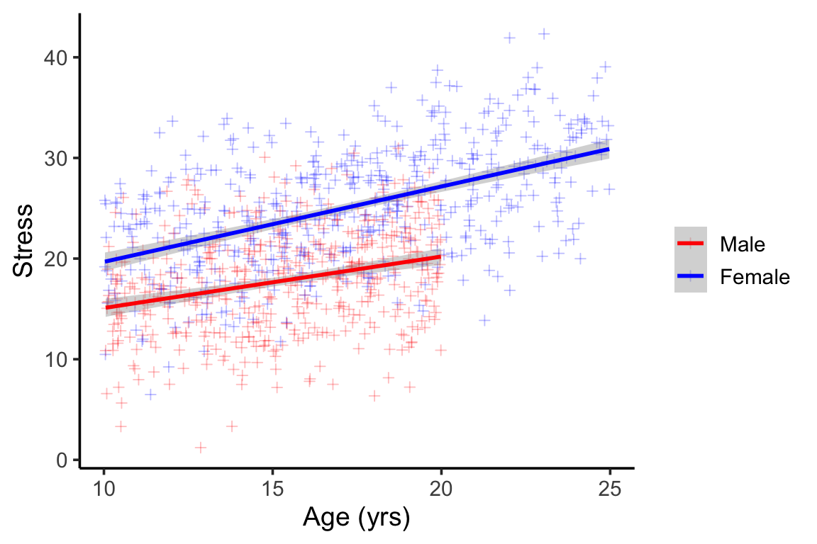
But of course, we the researcher don’t know that or don’t perceive that, and so, we might just go and fit our main effects models and not account for interactions, thinking that this might give us unbiased estimates.
This would be known as model misspecification – that is the model we fit does not accurately reflect how the data was generated or the real relationships at hand.
Figure 8 shows us the importance of proper model specification.
sims_df2 <- as_tibble(t(
  replicate(
    1000,
    fit_models(true_beta_interaction=0.2)
  )
)) |>
  mutate(condition = "Biased sampling\n(No males > 20yrs old)") |>
  bind_rows(as_tibble(t(
    replicate(
      1000,
      fit_models(true_beta_interaction=0.2,
                 male_max_age = 25)
    )
  )) |>
    mutate(condition = "Unbiased sampling\n(Males & females have same distribution)"))

sims_df2 <- sims_df2 |>
  pivot_longer(-condition) |>
mutate(bias = value - 0.5)p12 <- sims_df2 |>
ggplot(aes(x=value, fill = name)) +
geom_density( alpha =0.5) +
facet_wrap(~condition) +
labs(x = 'Estimated effect',
y = "Stress")+
geom_vline(xintercept = 0.5,
linetype = 2,
color = 'black',
alpha = 0.5) +
annotate(geom = "text",
y = Inf,
x = 0.6,
vjust = 1.5,
hjust = 0.3,
label = "<- True effect")
p22 <- sims_df2 |>
ggplot(aes(x=bias, fill = name)) +
geom_density( alpha =0.5) +
facet_wrap(~condition) +
labs(x = "Difference in observed & true effect (bias)",
y = "Stress") +
geom_vline(xintercept = 0,
linetype = 2,
color = 'black',
alpha = 0.5)+
annotate(geom = "text",
y = Inf,
x = 0,
vjust = 1.5,
hjust = 0,
label = "<- No bias")
(p12/p22) + plot_layout(guides = "collect") &
scale_fill_manual("Adjusted for confounding", values = c("darkgreen", "red"),
labels = c("Yes",
"No")) &
theme(legend.position = 'bottom')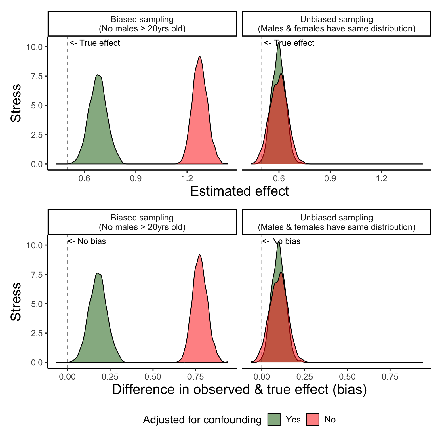
Ok, so what if we correctly specify our model? What if we add in an interaction term between age and sex?
Figure 9 show us that correct model specification does help us recover the real relationships! However…. as you’ll see, the variance is much higher… and this is likely because we simply cannot get a good estimate of the real interaction from a sample of incomplete data.
So, to rank the models from worst (or most biased) to least we have:
fit_models_with_int <- function(n = 1000,
                          min_age = 10,
                          male_max_age = 15,
                          female_max_age = 25,
                          mean_age = 18,
                          sd_age = 10,
                          true_beta_age = 0.5,
                          true_beta_sex = 5,
                          true_beta_interaction = 0,
                          sigma = 5) {
  # Generate data
  data <- generate_data(
    n,
    min_age,
    male_max_age,
    female_max_age,
    mean_age,
    sd_age,
    true_beta_age,
    true_beta_sex,
    true_beta_interaction,
    sigma
  )

  # Fit models
  model1 <- lm(y ~ age, data = data)
  model2 <- lm(y ~ age + sex, data = data)
  model3 <- lm(y ~ age*sex, data = data)

  # Extract coefficients for age
  c(
    unadjusted = coef(model1)["age"],
    adjusted = coef(model2)["age"],
    interaction_adjusted = coef(model3)["age"]
  )
}sims_df3 <- as_tibble(t(
replicate(
1000,
fit_models_with_int(true_beta_interaction=0.2)
)
)) |>
mutate(condition = "Biased sampling\n(No males > 20yrs old)") |>
bind_rows(as_tibble(t(
replicate(
1000,
fit_models_with_int(true_beta_interaction=0.2,
male_max_age = 25)
)
)) |>
mutate(condition = "Unbiased sampling\n(Males & females have same ages)"))
sims_df3 <- sims_df3 |>
pivot_longer(-condition) |>
mutate(bias = value - 0.5)p13 <- sims_df3 |>
ggplot(aes(x=value, fill = name)) +
geom_density( alpha =0.5) +
facet_wrap(~condition) +
labs(x = 'Estimated effect',
y = "Stress")+
geom_vline(xintercept = 0.5,
linetype = 2,
color = 'black',
alpha = 0.5) +
annotate(geom = "text",
y = Inf,
x = 0.6,
vjust = 1.5,
hjust = 0.2,
label = "<- True effect")
p23 <- sims_df3 |>
ggplot(aes(x=bias, fill = name)) +
geom_density( alpha =0.5) +
facet_wrap(~condition) +
labs(x = "Difference in observed & true effect (bias)",
y = "Stress") +
geom_vline(xintercept = 0,
linetype = 2,
color = 'black',
alpha = 0.5)+
annotate(geom = "text",
y = Inf,
x = 0,
vjust = 1.5,
hjust = 0,
label = "<- No bias")
(p13/p23) + plot_layout(guides = "collect") &
scale_fill_manual("Adjusted for", values = c("darkgreen", "blue", "red"),
labels = c("Sex only",
"Age * Sex interaction",
"None")) &
theme(legend.position = 'bottom')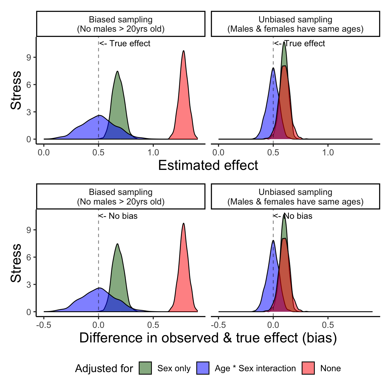
In a perfect world where you only need to consider a few known variables and have perfect model specification that matches the real relationships perfectly, you can use models to correct for sampling bias…
But we live in a very imperfect world… And 95% of science is about discovering relationships! We don’t often go into our analyses knowing the exact models.
So, remember:
In a world full of imperfect data and messy recruitment, our best defense is thoughtful model specification — but even that has limits.
Statistical Bias: Systematic difference in the true effect and the one that is observed, due to factors such as improper study design, data collection, or selective reporting, which can lead to exaggerated or misleading conclusions.
In math language, this is conceptualized as the difference between the an estimated parameter, or the “expected value” of that parameter (e.g., the mean from a dataset we collected), and the real parameter:
\[ Bias = E[\hat{\mu}] - \mu_{true} \]
Estimators, like means, have a distribution. So, just because you observe a mean that is different than the true mean doesn’t mean you are observing “bias” necessarily. Instead, you might be just in the lower-probability area of sampling distribution.
A truly biased statistical estimator is one that is consistently or systematically resulting in an estimate that is incorrect. So, on average, it’s estimation differs from the true average.
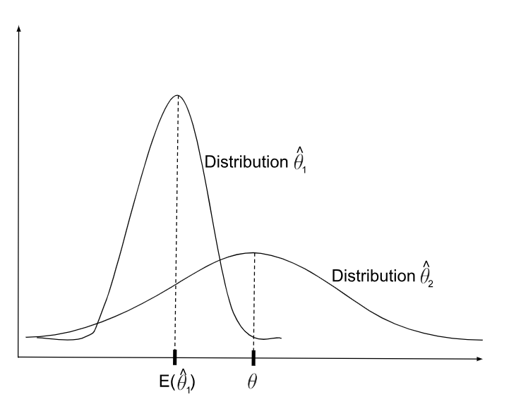
Now, ideally, we want to make sure that the statistic we are using to estimate a feature of the data actually reflects the true population. So, we want to minimize bias.
This classic example is used to demonstrate the fact that correlation \(\ne\) causation. But it is also a great example of confounding.
The example is about the fact that both ice cream sales and crime rates are positively correlated. Clearly, we know ice cream does not cause crime. But, what is it that ice cream sales and crime rates have in common? Temperature. As it’s gets hotter, we buy more ice cream. And as it gets hotter, there is generally more crime (because people are out and about).
And while this might feel quite obvious, it’s important to look at every scatter plot we see at the same level of scrutiny. What other factors might be causing the relationship we see?
set.seed(666)
n <- 500
temperature <- runif(n, min = 50, max = 100)  # degrees Fahrenheit

# Ice cream sales increase with temperature
ice_cream_sales <- 20 + 0.75 * temperature + rnorm(n, sd = 10)

# Crime also increases with temperature
crime_rate <- 50 + 0.8 * temperature + rnorm(n, sd = 10)

# Create a data frame
data <- tibble(ice_cream_sales,
               crime_rate,
temperature)f1 <- data |>
ggplot(aes(x=ice_cream_sales, y=crime_rate)) +
geom_point() +
labs(x='Ice cream sales',
y="Crime incidents") +
geom_smooth(method = 'lm', color = 'red') +
stat_cor(method = "pearson",
p.accuracy = 0.001,
label.x.npc = 0.1, label.y.npc = 0.95,
color = 'red')
f2 <- data |>
ggplot(aes(x=temperature, y=crime_rate)) +
geom_point() +
labs(x='Temperature',
y="Crime incidents") +
geom_smooth(method = 'lm', color = 'red') +
stat_cor(method = "pearson",
p.accuracy = 0.001,
label.x.npc = 0.1, label.y.npc = 0.95,
color = 'red')
f3 <- data |>
ggplot(aes(x=temperature, y=ice_cream_sales)) +
geom_point() +
labs(x='Temperature',
y="Ice cream sales") +
geom_smooth(method = 'lm', color = 'red') +
stat_cor(method = "pearson",
p.accuracy = 0.001,
label.x.npc = 0.1, label.y.npc = 0.95,
color = 'red')
top_row <- f1 + f2
bottom_row <- (plot_spacer() + f3 + plot_spacer()) +
plot_layout(widths = c(0.5, 1, 0.5))
(top_row / bottom_row) +
plot_layout(heights = c(1, 1),
widths = c(1, 1, 1)) +
plot_annotation(tag_levels = "A", tag_suffix = ".")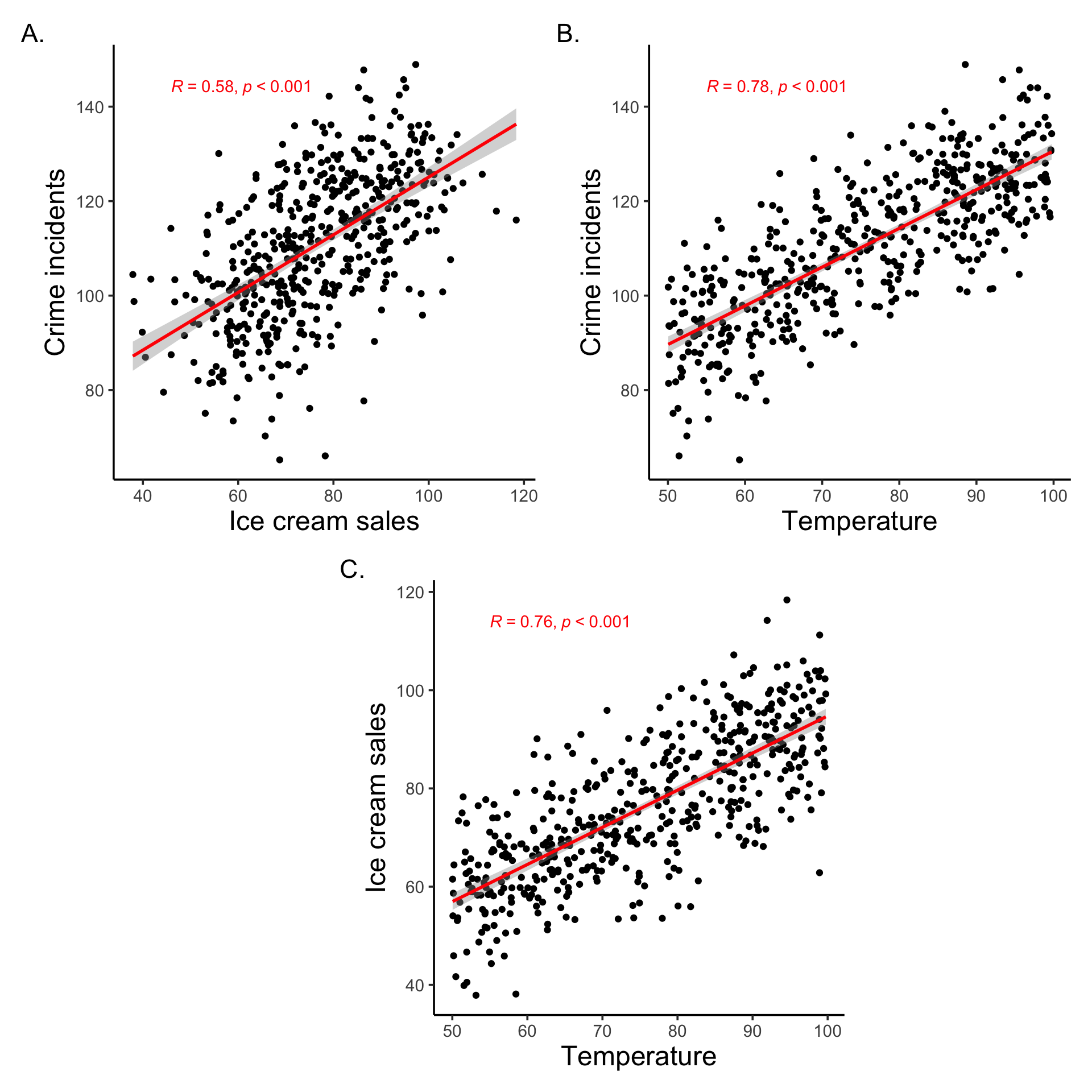
data |>
    ggplot(aes(x=ice_cream_sales,
               y=crime_rate,
               color = temperature)) +
    geom_point() +
    labs(x='Ice cream sales',
         y="Crime incidents") +
    geom_smooth(method = 'lm', color = 'black') +
    stat_cor(method = "pearson",
             p.accuracy = 0.001,
             label.x.npc = 0.05, label.y.npc = 0.05,
             color = 'black') +
  facet_wrap(~cut(temperature,
                  breaks = c(0, 60, 70, 80, 90, 100),
                  include.lowest = T,
                  right = F,
                  labels = c("<60F",
                             "60F-69F",
                             "70F-79F",
                             "80F-89F",
                             "90F-100F"))) +
  theme(legend.position = 'inside',
        legend.position.inside = c(0.9, 0.2))  +
  scale_color_gradient2(name = "Temperature",
                        low = "blue",
                        high = "red",
                        midpoint = 70)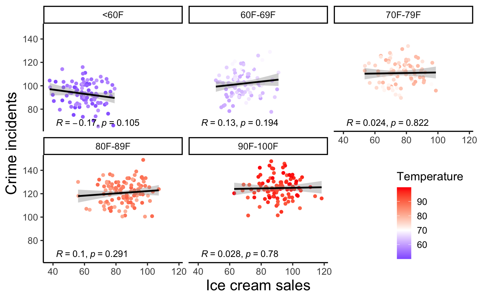
@online{graves2025,
  author = {Graves, Jess},
  title = {Convenient {Sampling} \& {Inconvenient} {Truths}},
  date = {2025-06-10},
  url = {https://JessLGraves.github.io/posts/2025-06-01-confounding/},
  langid = {en}
}