Estimate percent change in longitudinal data using log-transformations and {emmeans}
longitudinal data analysis
simulation
emmeans
lme4
R
Author
Jess Graves
Published
February 9, 2025
Summary
The purpose of this post is to chronicle my learnings on how to estimate percent change in longitudinal data in R using {lme4}(Bates et al. 2015) and {emmeans}(Lenth 2025).
Introduction
In longitudinal studies and clinical trials, we often want to be able to compare how changes from baseline differ across groups – specifically what the percent change from baseline is and how that differs across groups.
It’s tempting to re-calculate the outcome itself as percent change (\(Y_{\%\Delta} = 100*\frac{Y_t - Y_{t-1}}{Y_{t-1}}\)) and then perform the statistical test of your choice on that new outcome. However, this isn’t a robust choice for a few reasons (which maybe warrants its own blog post? (In the meantime, see this collection of statistical myths, and other references 5). But, to summarize, converting your longitudinal data to a percent change score leaves you open to bias through:
Regression to the mean
Mathematical coupling
Skewness & non-normality
Heteroscedasticity & increased variability
Log-transformations to the rescue!
If your data are > 0 you can reliably estimate percent change by simply taking the log(y) of your outcome. If your data do include 0 (but are never < 0) , then you can do log(y+1) .
Method
Simulate some longitudinal data
Fit a linear mixed effects model to estimate group, time, and time x group effects with subjects as random intercepts, like:
Use {emmeans}(Lenth 2025) to do post-hoc comparisons to estimate percent changes & compare across groups
Code
I’m going to use the {simstudy} library to generate longitudinal data that has three timepoints across three treatment groups (Placebo, Treatment A, & Treatment B).
We’re going to simulate a longitudinal dataset for a randomized control trial with 3 parallel groups with 3 total visits. I’ll transform it to long format to make it easier to work with.
Code for generating data in {simstudy}
set.seed(1111)def <-defData(id ="id", varname ="placeholder", formula =0) # Treatment probabilitiesdef <-defDataAdd(def, varname ="trt", formula ='0.33;0.33;0.34', dist ="categorical") # Baseline valuedef <-defDataAdd(def, varname ="baseline", formula =20, variance =0.5) # Visit 1 valuesdef <-defDataAdd(def, varname ="visit1", formula ="ifelse(trt == 1, baseline, ifelse(trt == 2, baseline - 0.5, baseline - 2))",variance = .2) # Visit 2 valuesdef <-defDataAdd(def, varname ="visit2", formula ="ifelse(trt == 1, visit1, ifelse(trt == 2, visit1 - 1, visit1 - 3))", variance = .2) # Total Nn <-130# Generate the datadd_all <-genData(n = n, dtDefs = def) %>% dplyr::select(-placeholder)# Long formatdf <- dd_all %>%pivot_longer(-c(1:2), names_to='time', values_to='score') %>%mutate(time=factor(time, labels=c('Baseline', 'Visit 1', 'Visit 2')), trt =factor(trt, labels=c('Placebo', 'Treatment A', 'Treatment B')), id=factor(id))head(df)
# A tibble: 6 × 4
  id    trt         time     score
  <fct> <fct>       <fct>    <dbl>
1 1     Treatment B Baseline  20.2
2 1     Treatment B Visit 1   18.6
3 1     Treatment B Visit 2   15.4
4 2     Placebo     Baseline  19.4
5 2     Placebo     Visit 1   19.8
6 2     Placebo     Visit 2   19.8
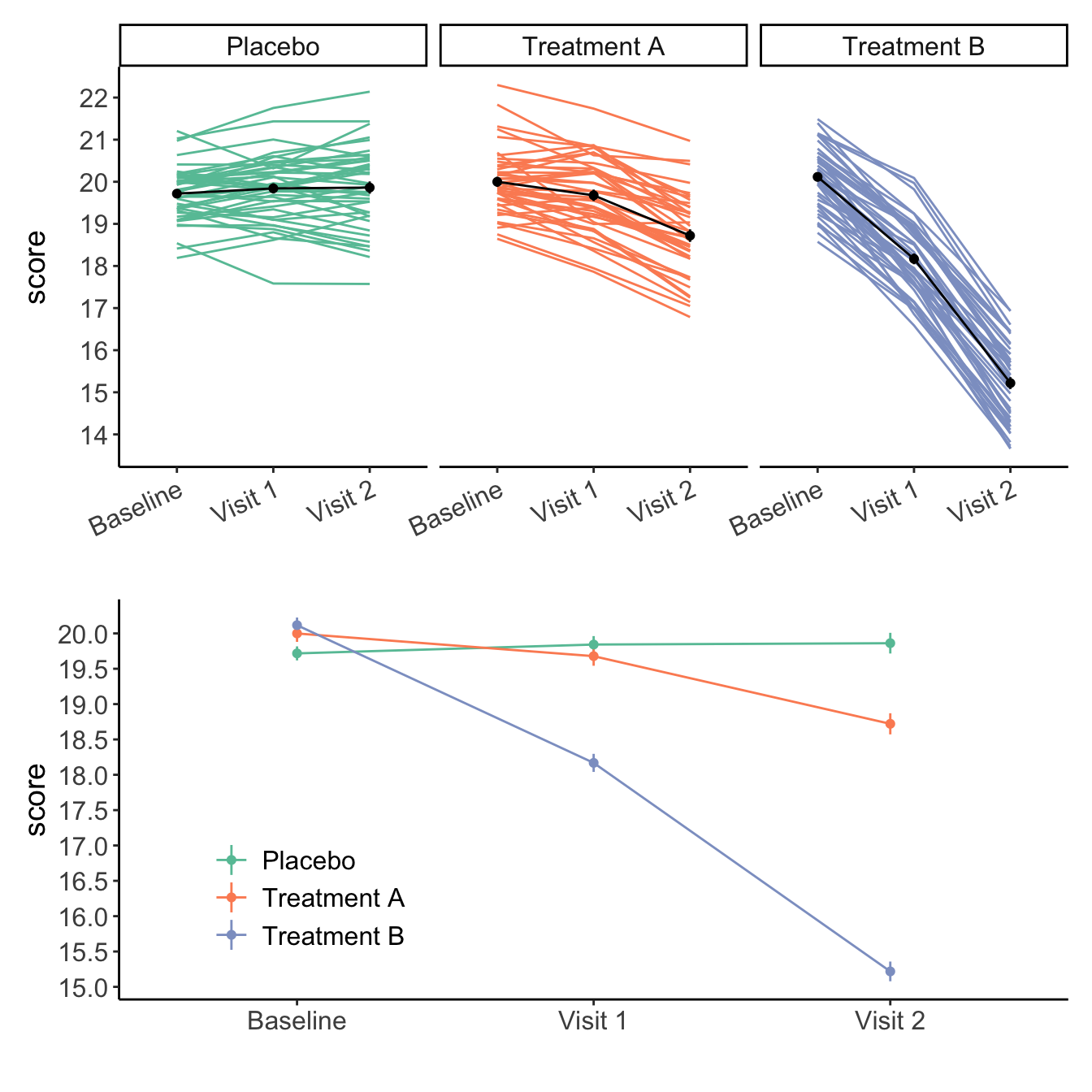
Visualizing the data
So, plotting the data (Figure 1), we can see in the data that Placebo group stays stable, Treatment A and B both show reductions from baseline, with Treatment B showing more reductions than Treatment A.
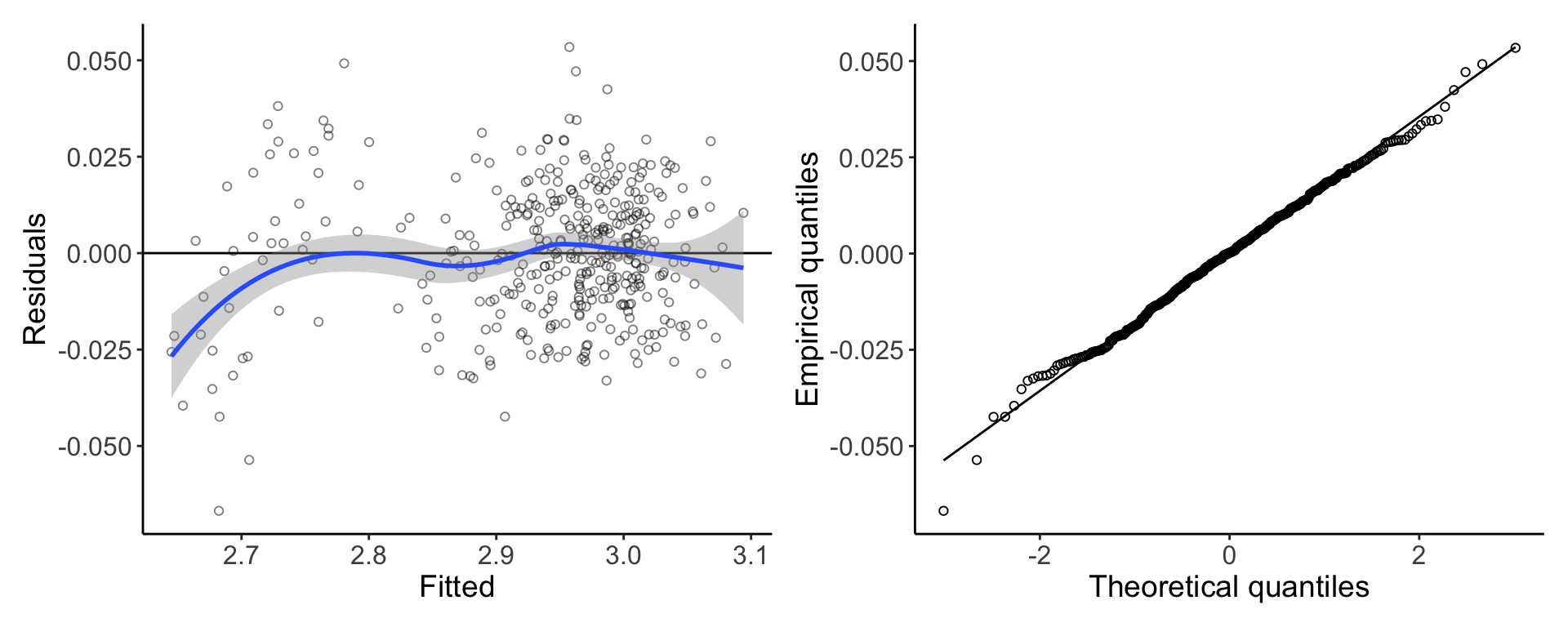
Figure 2. Diagnostics of regression model show assumptions are largely met
Statistical tests
I personally like to use {emmeans}(Lenth 2025) to perform post-hoc statistical tests based on a fit model. Though I know there are some other great packages out there too!
Wuick sidebar on log transformations – recall that data are modeled on the natural-log scale. Therefore, when we calculate differences of logs, they are equivalent to the ratio of logs, which can be converted into percent changes.
Recall, rules of logs say: \(ln(a) - ln(b) = ln(\frac{a}{b})\)
As a very quick and crude example to show \(100*ln(\frac{a}{b}) \approx 100*((\frac{a}{b}) - 1)\), let \(a=110\) and \(b=100\): \[
\begin{aligned}
\text{Percent change} &\approx \text{Ratio of logs} \\
(\frac{a}{b}) -1 &\approx ln(\frac{a}{b}) \\
(\frac{110}{100}) -1 &\approx ln(\frac{110}{100}) \\
1.1-1 &\approx ln(1.1) \\
0.10 &\approx 0.095 \\
\end{aligned}
\]
ems <-emmeans(model, ~ time | trt,data = df, infer = T)# Calculate percent change within groups# ln(a) - ln(b) = ln(a/b) approx a/b - 1pct_change <-contrast(ems,method ="trt.vs.ctrl",infer = T,# type = 'response' tells emmeans to present as a ratiotype ="response")pct_change
trt = Placebo:
 contrast           ratio      SE  df lower.CL upper.CL null t.ratio p.value
 Visit 1 / Baseline 1.006 0.00460 254    0.996    1.016    1   1.333  0.3144
 Visit 2 / Baseline 1.007 0.00461 254    0.996    1.017    1   1.463  0.2536

trt = Treatment A:
 contrast           ratio      SE  df lower.CL upper.CL null t.ratio p.value
 Visit 1 / Baseline 0.984 0.00455 254    0.974    0.994    1  -3.554  0.0009
 Visit 2 / Baseline 0.936 0.00433 254    0.926    0.945    1 -14.393  <.0001

trt = Treatment B:
 contrast           ratio      SE  df lower.CL upper.CL null t.ratio p.value
 Visit 1 / Baseline 0.903 0.00404 254    0.894    0.912    1 -22.871  <.0001
 Visit 2 / Baseline 0.756 0.00338 254    0.748    0.763    1 -62.651  <.0001

Degrees-of-freedom method: kenward-roger
Confidence level used: 0.95
Conf-level adjustment: dunnettx method for 2 estimates
Intervals are back-transformed from the log scale
P value adjustment: dunnettx method for 2 tests
Tests are performed on the log scale
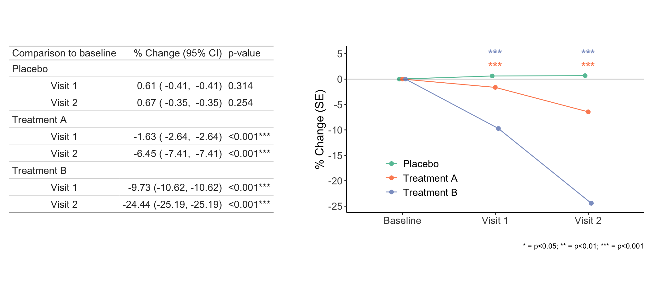
We can interpret these ratios as: “For a given reatment group, Visit 1 is [ratio] times the Baseline value”. Ratio < 1 means reduction, ratio > 1 means increase.
To convert these to percent changes, we’ll just do 100*(ratio - 1).
Within group changes from baseline
Here is some hidden code that tidy’s up the output for plotting and outputting tables – I don’t want to force you to suffer it, but click to open if you want!
Code for tidying the output
pct_change_tidy <- pct_change %>%as_tibble()# Cleaning up the results for figuring & tabeling res <- pct_change_tidy %>%# Converting ratio to % and formatting as character mutate(across(c(ratio, lower.CL, upper.CL),.fns =~format(round(100* (.x -1), 2), nsmall =2),.names ="{.col}_pct_chr" )) %>%# and as numericmutate(across(c(ratio, lower.CL, upper.CL),.fns =~ (100* (.x -1)),.names ="{.col}_pct" )) %>%# Characters get concatenated so that we can reporte them more easilymutate(pct_change =paste0( ratio_pct_chr, " (", lower.CL_pct_chr, ", ", lower.CL_pct_chr, ")" ),# Adding stars for significance levelsstars =format_pvalues(p.value, stars_only=T),p.value =format_pvalues(p.value),Day =unlist(lapply(str_split(contrast, " / "), function(f) f[[1]])) ) %>%# Adding in 'Baseline' data which is 0 so that we can visualize that drop from 'Baseline'full_join(., crossing(contrast ="Baseline",trt =factor(unique(df$trt)),ratio_pct =0 )) %>%# Factoring & re-labelingmutate(Day =factor(contrast,levels =c("Baseline","Visit 1 / Baseline","Visit 2 / Baseline" ),labels =c("Baseline", "Visit 1", "Visit 2") )) %>%# Only keeping the relevant columns dplyr::select(Day, trt, ratio, SE, contains('pct'), -contains('pct_chr'), stars, p.value)
Now we can plot the percent reductions (Figure 3) and put their significance values on the plot to show which groups have significant reductions from baseline.
Code for line plot
# Formatting significance data for plottingfig_stars <- res %>% dplyr::select(trt, Day, pct_change, stars) %>%arrange(Day, trt) %>%group_by(Day) %>%# Adding position markers for adding stars to the figuremutate(y.position =seq(0, 5, length =length(unique(df$trt)))) %>%filter(stars !="ns")fig3 <- res %>%ggplot(aes(x = Day, y = ratio_pct, color = trt)) +geom_line(aes(group = trt),position =position_dodge(width = .1) ) +geom_errorbar(aes(group = trt,ymin =100* ((ratio - SE) -1),ymax =100* ((ratio + SE) -1) ),width =0,position =position_dodge(width = .1), alpha =0.5 ) +geom_point(position =position_dodge(width = .1), size =2) +scale_color_brewer(palette='Set2') +scale_y_continuous(breaks = scales::pretty_breaks(8)) +theme(legend.position ="inside",legend.position.inside =c(0.25, 0.25) ) +labs(color='', x ="", y ="% Change (SE)") +geom_hline(yintercept =0, linetype =1, color ="black", alpha =0.25) +# Add significance stars to figuregeom_text(data = fig_stars,aes(x = Day, y = y.position, label = stars),size =5,show.legend = F,fontface ="bold" ) +labs(caption ="* = p<0.05; ** = p<0.01; *** = p<0.001")
Figure 3. Within group percent changes from baseline.
Between group comparisons of changes from baseline
I personally find it easier to think about differences of percents as absolute differences and not multiplicative, so if you want to get the absolute differneces in percent change across groups:
Fit percent changes, just like we did above, for each post-treatment time-point,
Use regrid() to tell {emmeans} to keep the ratio as the units we want, and
Use contrast() to get the differences of the percent changes (not the ratio of the percent changes)
🚧 NOTE: This is how I personally have figured out how to do this – if you know another way please let me know!
Alternatively, if you’re good with ratios of ratios, you can ignore the regrid()! The significance of the results will be fairly similar, especially for larger N. For smaller N, you’ll see some variability though.
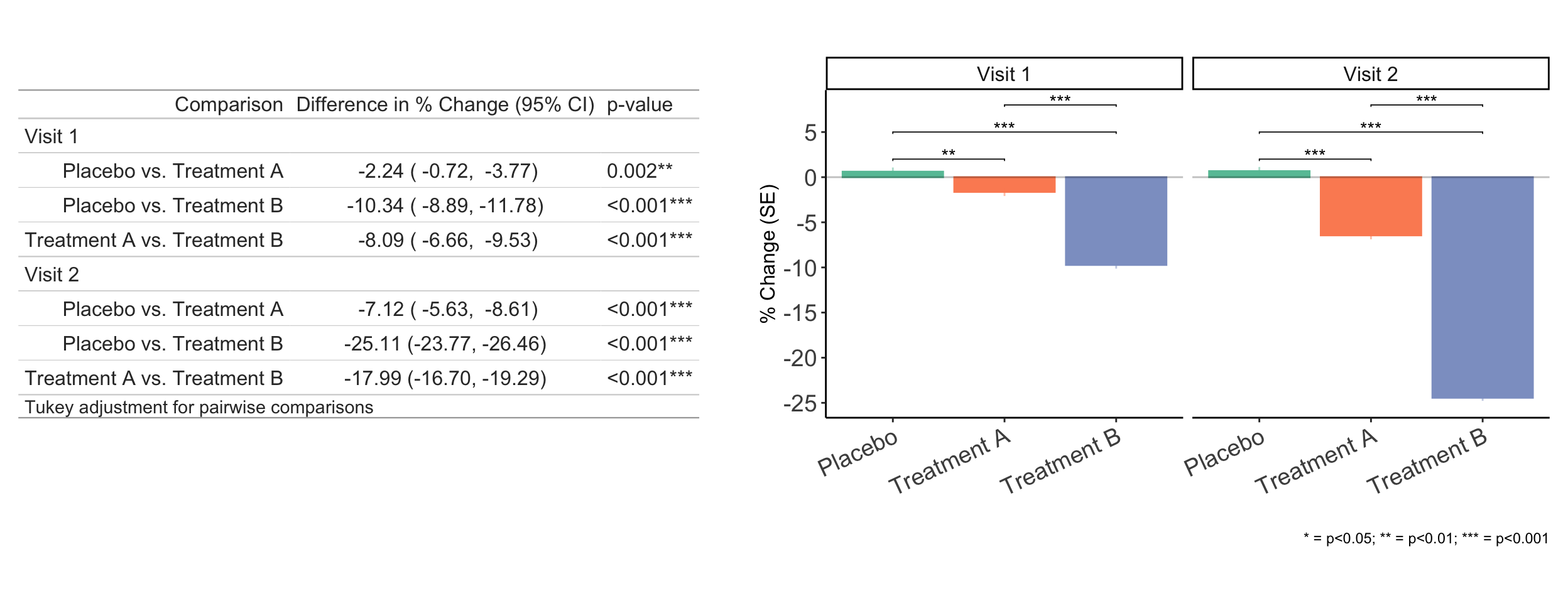
Figure 4 has the final results for these analyses in table + bar chart to visualize the differences.
Code of differences in percent changes across groups
# Grab everything but the baseline timepointdays <-levels(df$time)[-1]# Some list items to capture theseday_emmeans <- day_contrast <- day_pairwise_groups <- result <-list()for (i inseq_along(days)) {# Group emmeans only for Baseline & Day i day_emmeans[[i]] <-emmeans(model, ~ time * trt,data = df,at =list(time =c("Baseline", days[i] )) )# Calculating percent change relative for that Day i day_contrast[[i]] <-contrast(day_emmeans[[i]],method ="trt.vs.ctrl",by ="trt",adjust ="none",type ="response" )# Regrid tells emmeans to keep the units here# So that we can get absolute difference of the ratios day_pairwise_groups[[i]] <-regrid(day_contrast[[i]]) %>%contrast(method ="pairwise", by =NULL,infer = T )}results <-lapply( day_pairwise_groups, as_tibble) %>% dplyr::bind_rows()head(results)
We can interpret these are the -100*estimate difference in the percent reductions from baseline across treatment groups. So, for row 1, we say Treatment A affords -100*0.0224=-2.24 more percent reduction compared to Placebo.
Figure 4. Group differences in changes from baseline at each timepoint
References & other articles on change scores
Bates, Douglas, Martin Mächler, Ben Bolker, and Steve Walker. 2015. “Fitting Linear Mixed-Effects Models Using lme4.”Journal of Statistical Software 67 (1): 1–48. https://doi.org/10.18637/jss.v067.i01.
Clifton, Lei, and David A Clifton. 2019. “The Correlation Between Baseline Score and Post-Intervention Score, and Its Implications for Statistical Analysis.”Trials 20: 1–6.
Vickers, Andrew J. 2001. “The Use of Percentage Change from Baseline as an Outcome in a Controlled Trial Is Statistically Inefficient: A Simulation Study.”BMC Medical Research Methodology 1: 1–4.
Vickers, Andrew J, and Douglas G Altman. 2001. “Analysing Controlled Trials with Baseline and Follow up Measurements.”Bmj 323 (7321): 1123–24.
Citation
BibTeX citation:
@online{graves2025,
  author = {Graves, Jess},
  title = {Modeling Percent Change},
  date = {2025-02-09},
  url = {https://JessLGraves.github.io/posts/2025-02-09-percent-change/},
  langid = {en}
}
---title: "Modeling percent change"description: "Estimate percent change in longitudinal data using log-transformations and {emmeans}"author: - name: Jess Gravesdate: 02-09-2025execute-dir: projectcrossref: fig-title: '**Figure**' tbl-title: '**Table**' fig-labels: arabic tbl-labels: arabic title-delim: "."link-citations: trueexecute: echo: true warning: false message: falsecategories: [longitudinal data analysis, simulation, emmeans, lme4, R] # self-defined categoriesimage: preview-image.pngdraft: false bibliography: references.bibnocite: | @*# csl: statistics-in-biosciences.cslbibliographystyle: apacitation: true---## SummaryThe purpose of this post is to chronicle my learnings on how to estimate percent change in longitudinal data in R using {[lme4](https://cran.r-project.org/web/packages/lme4/index.html)}[@lme4] and {[emmeans](https://cran.r-project.org/web/packages/emmeans/index.html)}[@emmeans].## IntroductionIn longitudinal studies and clinical trials, we often want to be able to compare how changes from baseline differ across groups – specifically what the percent change from baseline is and how that differs across groups.It's tempting to re-calculate the outcome itself as percent change ($Y_{\%\Delta} = 100*\frac{Y_t - Y_{t-1}}{Y_{t-1}}$) and then perform the statistical test of your choice on that new outcome. However, this isn't a robust choice for a few reasons (which maybe warrants its own blog post? (In the meantime, [see this collection of statistical myths](https://discourse.datamethods.org/t/reference-collection-to-push-back-against-common-statistical-myths/1787#analyzing-change-measures-in-rcts-4), and [other references @sec-references]). But, to summarize, converting your longitudinal data to a percent change score leaves you open to bias through:- Regression to the mean- Mathematical coupling- Skewness & non-normality- Heteroscedasticity & increased variability**Log-transformations to the rescue!**If your data are [\>]{.underline} 0 you can reliably estimate percent change by simply taking the `log(y)` of your outcome. If your data do include 0 (but are never \< 0) , then you can do `log(y+1)` .## Method- Simulate some longitudinal data- Fit a linear mixed effects model to estimate group, time, and time x group effects with subjects as random intercepts, like: $$ \begin{aligned} Y_{it} = \beta_0 + \beta_1 (\text{Group}_i) + \beta_2 (\text{Time}_t) + \beta_3 (\text{Group}_i \times \text{Time}_t) + u_i + \epsilon_{it} \end{aligned} $$ - $Y_{it}$= outcome for subject $i$ & time $t$ - $\beta_0$ = overall intercept - $\beta_1$ = fixed effect for group assignment - $\beta_2$ = fixed effect for time - $\beta_3$ = fixed effect for interaction between time and group assignment - $u_i \sim N(0, \sigma_u^2)$ = random intercept for subject $i$ (accounts for individual differences) - $\epsilon_i \sim N(0, \sigma_u^2)$ = residual error- Use {[emmeans](https://cran.r-project.org/web/packages/emmeans/index.html)}[@emmeans] to do post-hoc comparisons to estimate percent changes & compare across groups## CodeI'm going to use the {[simstudy](https://cran.r-project.org/web/packages/simstudy/index.html)} library to generate longitudinal data that has three timepoints across three treatment groups (Placebo, Treatment A, & Treatment B).### Set up libraries & defaults```{r}#| code-summary: Code for libraries & custom functions & themeslibrary(tidyverse) library(simstudy)library(styler)library(patchwork)library(lme4)library(parameters)library(emmeans)# setting ggplot thememy_theme <-theme_classic() +theme(axis.text =element_text(size =12),axis.title =element_text(size =14),legend.text =element_text(size =12),legend.title =element_text(size =12), strip.text =element_text(size=12) )theme_set(my_theme)# Formatting p-values for significance for tablesformat_pvalues <-function(x, stars_only =FALSE, stars =TRUE) { r <-ifelse(x >=0.05, "",ifelse(x <0.001, "***",ifelse(x <0.01& x >=0.001, "**",ifelse(x >=0.01& x <0.05, "*", "") ) ) ) p <-ifelse(x <0.001, "<0.001", format(round(x, 3), nsmall =3)) rr <- pif (stars &!stars_only) { rr <-paste0(p, r) }if (stars_only & stars){ rr <- r } rr <-if_else(rr =="NANA"|is.na(rr), "", rr)return(rr)}```### Generating the dataWe're going to simulate a longitudinal dataset for a randomized control trial with 3 parallel groups with 3 total visits. I'll transform it to long format to make it easier to work with.```{r}#| code-summary: Code for generating data in {simstudy}set.seed(1111)def <-defData(id ="id", varname ="placeholder", formula =0) # Treatment probabilitiesdef <-defDataAdd(def, varname ="trt", formula ='0.33;0.33;0.34', dist ="categorical") # Baseline valuedef <-defDataAdd(def, varname ="baseline", formula =20, variance =0.5) # Visit 1 valuesdef <-defDataAdd(def, varname ="visit1", formula ="ifelse(trt == 1, baseline, ifelse(trt == 2, baseline - 0.5, baseline - 2))",variance = .2) # Visit 2 valuesdef <-defDataAdd(def, varname ="visit2", formula ="ifelse(trt == 1, visit1, ifelse(trt == 2, visit1 - 1, visit1 - 3))", variance = .2) # Total Nn <-130# Generate the datadd_all <-genData(n = n, dtDefs = def) %>% dplyr::select(-placeholder)# Long formatdf <- dd_all %>%pivot_longer(-c(1:2), names_to='time', values_to='score') %>%mutate(time=factor(time, labels=c('Baseline', 'Visit 1', 'Visit 2')), trt =factor(trt, labels=c('Placebo', 'Treatment A', 'Treatment B')), id=factor(id))head(df)```#### Visualizing the dataSo, plotting the data (@fig-spag), we can see in the data that Placebo group stays stable, Treatment A and B both show reductions from baseline, with Treatment B showing more reductions than Treatment A.```{r}#| fig-width: 7#| fig-height: 7#| label: fig-spag#| fig-cap: Spaghetti plot & observed means over time and treatment group #| code-summary: Code for spaghetti plotfig1 <- df %>%ggplot(aes(x=time, y=score, color=trt, group=trt)) +geom_line(aes(group=id), aes=0.5) +stat_summary(size=0.2, color='black') +stat_summary(color='black', geom='line') +facet_wrap(~trt) +scale_color_brewer(palette='Set2') +theme(legend.position='none', axis.text.x=element_text(angle=25, hjust=1)) +scale_y_continuous(breaks=scales::pretty_breaks(10)) +labs(x='')fig2 <- df %>%ggplot(aes(x=time, y=score, color=trt, group=trt)) +stat_summary(size=0.2) +stat_summary(geom='line') +scale_color_brewer(name='', palette='Set2') +scale_y_continuous(breaks=scales::pretty_breaks(10)) +labs(x='') +theme(legend.position='inside', legend.position.inside =c(0.2, 0.3))fig1 / fig2```### ModelingAs promised, we'll fit a LMM to model the data and test if these reductions are significant.```{r}#| code-fold: falsemodel <-lmer(log(score) ~ trt + time + trt * time + (1| id), data = df)``````{r}#| label: fig-diagnostics#| fig-cap: Diagnostics of regression model show assumptions are largely met#| fig-width: 10#| fig-height: 4#| code-summary: Code for diagnostic plots diags <-tibble(Fitted =fitted(model), Residuals =resid(model))fitted_resids <- diags %>%ggplot(aes(x = Fitted, y = Residuals)) +geom_point(alpha =0.5, shape =1) +geom_hline(yintercept =0) +stat_smooth()resid_qq <- diags %>%ggplot(aes(sample = Residuals)) +geom_qq(shape =1) +geom_qq_line() +labs(x ="Theoretical quantiles",y ="Empirical quantiles" )fitted_resids | resid_qq```### Statistical testsI personally like to use {[emmeans](https://cran.r-project.org/web/packages/emmeans/index.html)}[@emmeans] to perform post-hoc statistical tests based on a fit model. Though I know there are some other great packages out there too!Wuick sidebar on log transformations – recall that data are modeled on the natural-log scale. Therefore, when we calculate differences of logs, they are equivalent to the ratio of logs, which can be converted into percent changes.Percent change = $100 *\frac{a-b}{b} = 100*(\frac{a}{b}- 1)$Recall, rules of logs say: $ln(a) - ln(b) = ln(\frac{a}{b})$As a very quick and crude example to show $100*ln(\frac{a}{b}) \approx 100*((\frac{a}{b}) - 1)$, let $a=110$ and $b=100$:\$$\begin{aligned}\text{Percent change} &\approx \text{Ratio of logs} \\(\frac{a}{b}) -1 &\approx ln(\frac{a}{b}) \\(\frac{110}{100}) -1 &\approx ln(\frac{110}{100}) \\1.1-1 &\approx ln(1.1) \\0.10 &\approx 0.095 \\\end{aligned}$$```{r}#| code-fold: falseems <-emmeans(model, ~ time | trt,data = df, infer = T)# Calculate percent change within groups# ln(a) - ln(b) = ln(a/b) approx a/b - 1pct_change <-contrast(ems,method ="trt.vs.ctrl",infer = T,# type = 'response' tells emmeans to present as a ratiotype ="response")pct_change```We can interpret these ratios as: "For a given reatment group, Visit 1 is \[`ratio`\] times the Baseline value". Ratio \< 1 means reduction, ratio \> 1 means increase.To convert these to percent changes, we'll just do `100*(ratio - 1)`.#### Within group changes from baselineHere is some hidden code that tidy's up the output for plotting and outputting tables – I don't want to force you to suffer it, but click to open if you want!```{r}#| label: fig-pct-change-line#| echo: true#| code-summary: Code for tidying the outputpct_change_tidy <- pct_change %>%as_tibble()# Cleaning up the results for figuring & tabeling res <- pct_change_tidy %>%# Converting ratio to % and formatting as character mutate(across(c(ratio, lower.CL, upper.CL),.fns =~format(round(100* (.x -1), 2), nsmall =2),.names ="{.col}_pct_chr" )) %>%# and as numericmutate(across(c(ratio, lower.CL, upper.CL),.fns =~ (100* (.x -1)),.names ="{.col}_pct" )) %>%# Characters get concatenated so that we can reporte them more easilymutate(pct_change =paste0( ratio_pct_chr, " (", lower.CL_pct_chr, ", ", lower.CL_pct_chr, ")" ),# Adding stars for significance levelsstars =format_pvalues(p.value, stars_only=T),p.value =format_pvalues(p.value),Day =unlist(lapply(str_split(contrast, " / "), function(f) f[[1]])) ) %>%# Adding in 'Baseline' data which is 0 so that we can visualize that drop from 'Baseline'full_join(., crossing(contrast ="Baseline",trt =factor(unique(df$trt)),ratio_pct =0 )) %>%# Factoring & re-labelingmutate(Day =factor(contrast,levels =c("Baseline","Visit 1 / Baseline","Visit 2 / Baseline" ),labels =c("Baseline", "Visit 1", "Visit 2") )) %>%# Only keeping the relevant columns dplyr::select(Day, trt, ratio, SE, contains('pct'), -contains('pct_chr'), stars, p.value)``````{r, include=F}#| label: tbl-output#| tbl-cap: Example rows of cleaned up outputlibrary(DT)datatable(res %>% mutate(across(where(is.numeric), ~round(.x, 3))), options = list(scrollX = TRUE, scrollY = '400px', searching = FALSE, lengthChange = FALSE, paging = FALSE, info = FALSE, ordering = FALSE ))```Now we can plot the percent reductions (@fig-pct-change) and put their significance values on the plot to show which groups have significant reductions from baseline.```{r}#| code-summary: Code for line plot# Formatting significance data for plottingfig_stars <- res %>% dplyr::select(trt, Day, pct_change, stars) %>%arrange(Day, trt) %>%group_by(Day) %>%# Adding position markers for adding stars to the figuremutate(y.position =seq(0, 5, length =length(unique(df$trt)))) %>%filter(stars !="ns")fig3 <- res %>%ggplot(aes(x = Day, y = ratio_pct, color = trt)) +geom_line(aes(group = trt),position =position_dodge(width = .1) ) +geom_errorbar(aes(group = trt,ymin =100* ((ratio - SE) -1),ymax =100* ((ratio + SE) -1) ),width =0,position =position_dodge(width = .1), alpha =0.5 ) +geom_point(position =position_dodge(width = .1), size =2) +scale_color_brewer(palette='Set2') +scale_y_continuous(breaks = scales::pretty_breaks(8)) +theme(legend.position ="inside",legend.position.inside =c(0.25, 0.25) ) +labs(color='', x ="", y ="% Change (SE)") +geom_hline(yintercept =0, linetype =1, color ="black", alpha =0.25) +# Add significance stars to figuregeom_text(data = fig_stars,aes(x = Day, y = y.position, label = stars),size =5,show.legend = F,fontface ="bold" ) +labs(caption ="* = p<0.05; ** = p<0.01; *** = p<0.001") ``````{r}#| code-summary: Code for tablelibrary(gt)table <- res %>%na.omit() %>% dplyr::select(trt, Day, pct_change, p.value) %>%rename(Treatment = trt, `Comparison to baseline`= Day, `% Change (95% CI)`= pct_change, `p-value`= p.value) %>%group_by(Treatment) %>%gt()```Great! Just as we suspected! Treatment A and B do show significant reductions. Does Treatment B truly work better?```{r}#| code-summary: Code combined table & line plot#| label: fig-pct-change#| fig-cap: Within group percent changes from baseline. #| fig-width: 11#| fig-height: 5wrap_table(table, panel='full', space='free_x') + fig3```#### Between group comparisons of changes from baselineI personally find it easier to think about differences of percents as absolute differences and not multiplicative, so if you want to get the absolute differneces in percent change across groups:1. Fit percent changes, just like we did above, for each post-treatment time-point,2. Use `regrid()` to tell {emmeans} to keep the ratio as the units we want, and3. Use `contrast()` to get the differences of the percent changes (not the ratio of the percent changes)🚧 NOTE: This is how *I personally* have figured out how to do this – if you know another way please let me know!Alternatively, if you're good with ratios of ratios, you can ignore the `regrid()`! The significance of the results will be fairly similar, especially for larger N. For smaller N, you'll see some variability though.@fig-bar-group-diffs has the final results for these analyses in table + bar chart to visualize the differences.```{r}#| code-summary: Code of differences in percent changes across groups# Grab everything but the baseline timepointdays <-levels(df$time)[-1]# Some list items to capture theseday_emmeans <- day_contrast <- day_pairwise_groups <- result <-list()for (i inseq_along(days)) {# Group emmeans only for Baseline & Day i day_emmeans[[i]] <-emmeans(model, ~ time * trt,data = df,at =list(time =c("Baseline", days[i] )) )# Calculating percent change relative for that Day i day_contrast[[i]] <-contrast(day_emmeans[[i]],method ="trt.vs.ctrl",by ="trt",adjust ="none",type ="response" )# Regrid tells emmeans to keep the units here# So that we can get absolute difference of the ratios day_pairwise_groups[[i]] <-regrid(day_contrast[[i]]) %>%contrast(method ="pairwise", by =NULL,infer = T )}results <-lapply( day_pairwise_groups, as_tibble) %>% dplyr::bind_rows()head(results)```We can interpret these are the `-100*estimate` difference in the percent reductions from baseline across treatment groups. So, for row 1, we say Treatment A affords `-100*0.0224=-2.24` more percent reduction compared to Placebo.```{r}#| code-summary: Code to pretty up results for tables results_to_table0 <- results %>%mutate(contrast =gsub("\\(|\\)", "", contrast),Day =map_chr(str_split(contrast, "/"),~ .x[1] ),Comparison =gsub("\\Visit \\d+/Baseline ", "", contrast ),Comparison =gsub("-", "vs.", Comparison),`p-value`=format_pvalues(p.value),stars =format_pvalues(p.value, stars_only =TRUE),`Difference in % Change (95% CI)`=paste0(format(round(-100* estimate, 2), nsmall =2)," (", format(round(-100* lower.CL, 2), nsmall =2),", ",format(round(-100* upper.CL, 2), nsmall =2),")" ) )results_to_table <- results_to_table0 %>% dplyr::select(Day, Comparison, contains("95%"), `p-value`) %>%mutate(across(c(Day, Comparison), factor))# gt table to put in plottable_grp_diffs <- results_to_table %>%group_by(Day) %>%gt() %>%tab_footnote("Tukey adjustment for pairwise comparisons") %>%cols_align(align =c("right"), columns =c(1, 2)) %>%cols_align(align =c("center"), columns =3)``````{r}#| code-summary: Code to create significance lines for plotting group differenceslines <- results_to_table0 %>%mutate(group1 =map_chr(str_split(Comparison, " vs. "),~ .x[1] )) %>%mutate(group2 =map_chr(str_split(Comparison, " vs. "),~ .x[2] )) %>% dplyr::select( group1, group2, Day, estimate, lower.CL, stars ) %>%group_by(Day) %>%filter(stars !="ns") %>%mutate(y.position =seq(2, 8, length =n())) %>%ungroup() %>%mutate(Day =factor(Day))``````{r}#| code-summary: Code to create barplot to illustrate group differenceslibrary(ggpubr)figbar <- res %>%na.omit() %>%ggplot(aes(x = trt, y = ratio_pct, color = trt, fill = trt)) +geom_bar(aes(group = trt),stat ="identity", position =position_dodge(width = .1) ) +geom_errorbar(aes(group = trt,ymin =100* ((ratio - SE) -1),ymax =100* ((ratio + SE) -1) ),width =0,position =position_dodge(width = .1), alpha =0.5 ) +scale_color_brewer(name ="", palette ="Set2") +scale_fill_brewer(name ="", palette ="Set2") +theme_classic() +scale_y_continuous(breaks = scales::pretty_breaks(6),limits =c(-25, 8) ) +theme(axis.title =element_text(size =12),axis.text =element_text(size =14),axis.text.x =element_text(angle =25, hjust =1),legend.text =element_text(size =11),legend.position ="none",legend.position.inside =c(0.1, 0.25),legend.background =element_blank(),strip.text =element_text(size =12) ) +labs(x ="", y ="% Change (SE)") +geom_hline(yintercept =0, linetype =1, color ="black", alpha =0.25) +labs(caption ="* = p<0.05; ** = p<0.01; *** = p<0.001") +facet_wrap(~Day) +# adding p-value lines from ggpubrstat_pvalue_manual(data = lines, label ="stars", xmin ="group1", xmax ="group2",inherit.aes = F, tip =0.005 )``````{r}#| code-summary: Code for final figure#| fig-width: 13#| fig-height: 5#| label: fig-bar-group-diffs#| fig-cap: Group differences in changes from baseline at each timepointtbl_fig_grp_diffs <-wrap_table(table_grp_diffs,panel ="full", space ="free_x") + figbartbl_fig_grp_diffs# # ggsave('preview-image.png', tbl_fig_grp_diffs,# units='cm',# width=16*2,# height=6*2)```## References & other articles on change scores {#sec-references}::: {#refs}:::